

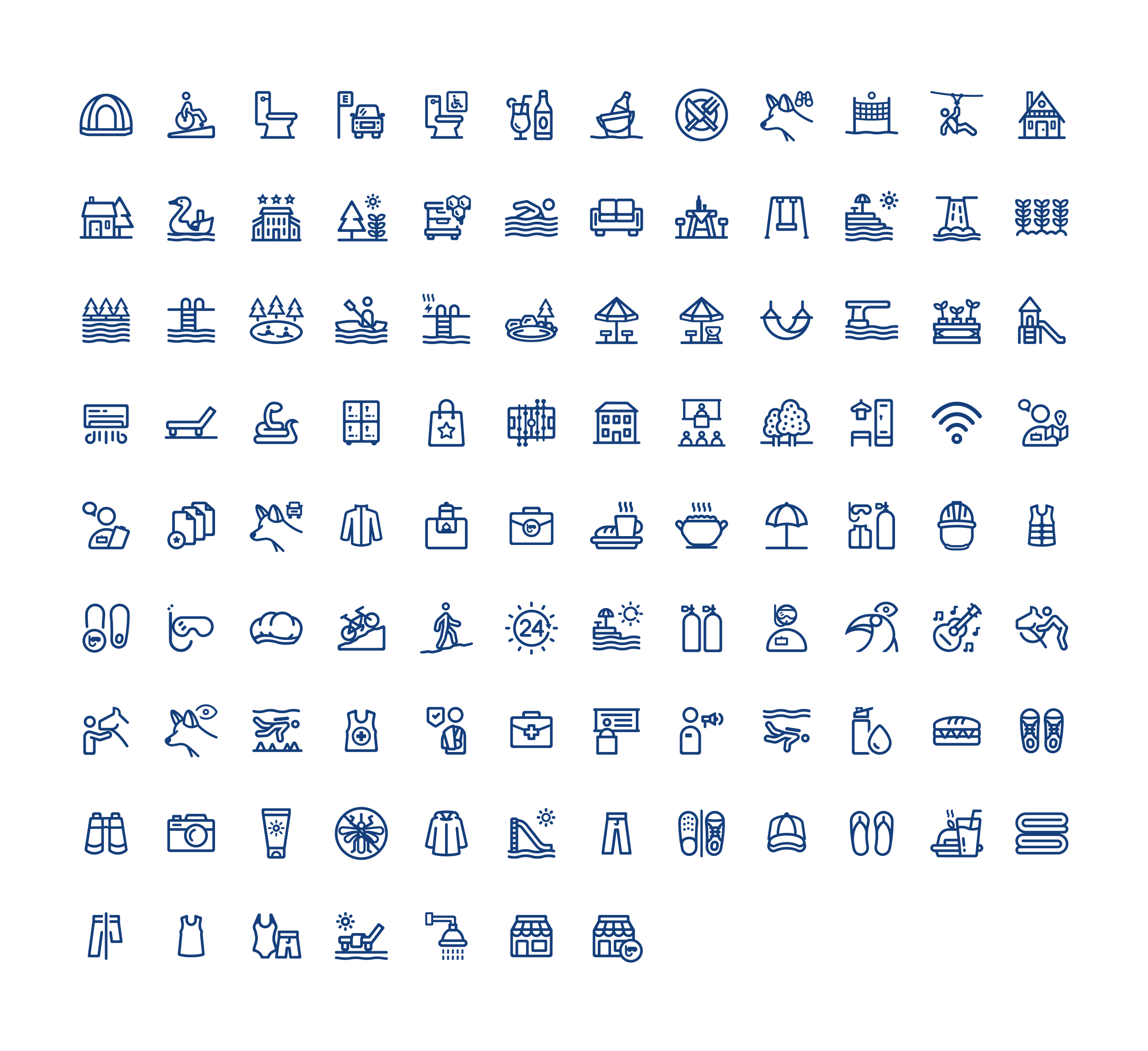
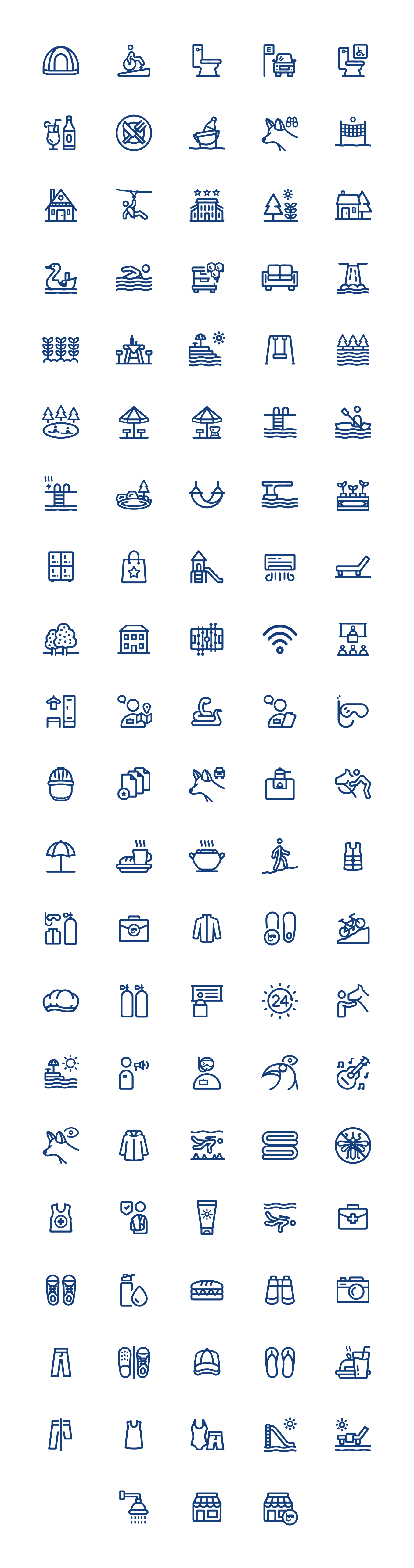
Icon system design
Bonito, Mato Grosso do Sul, is one of Brazil’s most popular eco-tourism destinations, operating under a strict “voucher system” that requires every tour to be booked in advance. Portal Bonito is a voluntary, non-profit initiative that serves as a central hub for this ecosystem, allowing tourists to discover and compare tour and activity options.
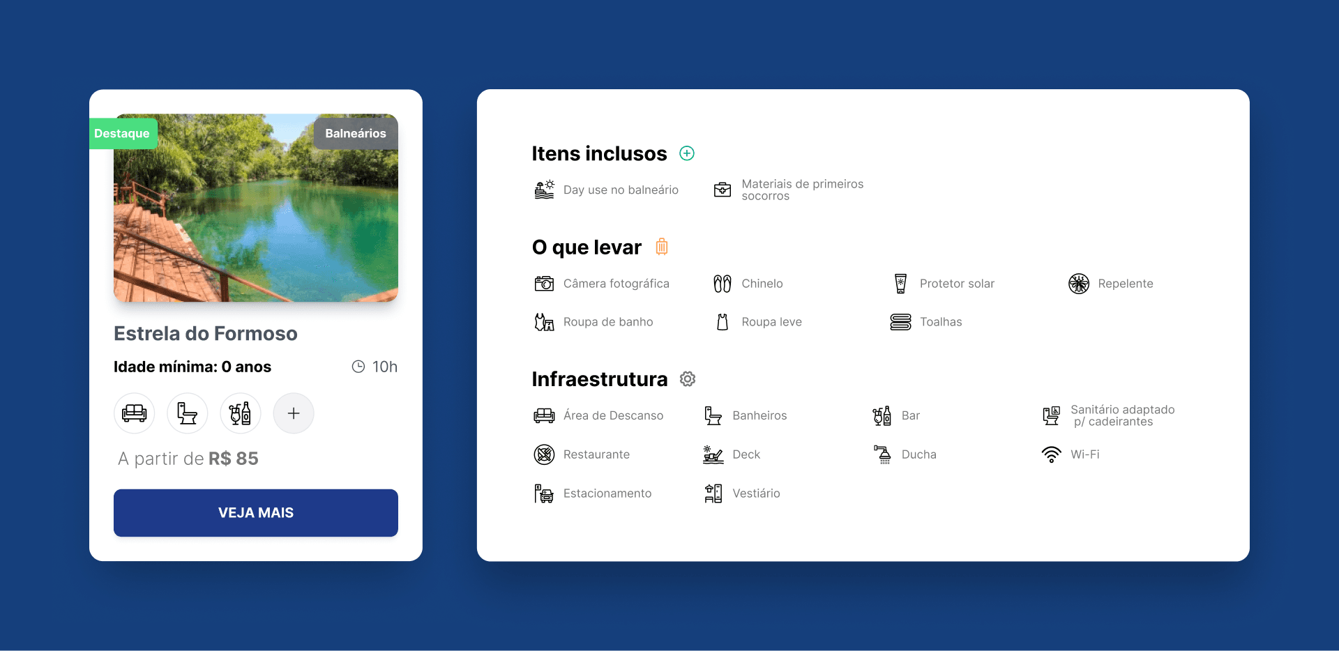
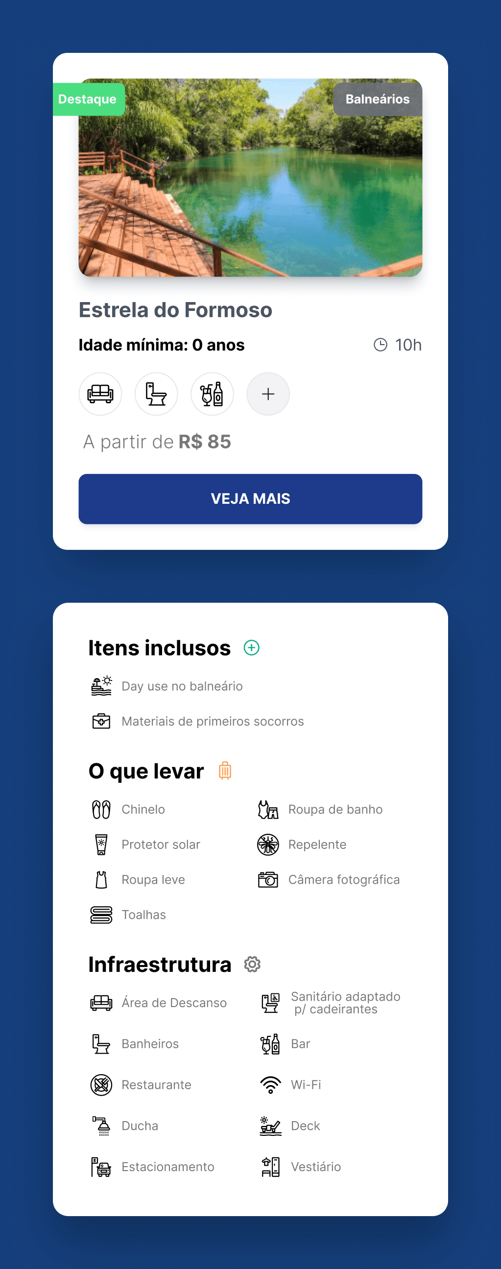
Because of the strict regulations, every tour must include logistical details, from mandatory equipment like neoprene suits to specific accessibility infrastructure. Relying on text descriptions slowed down readability, and standard icon libraries (like Google’s Material Design) weren’t specific enough to the region’s needs and biodiversity.
Core objectives:
Design a custom library of 103 icons to replace text-heavy descriptions and standard, generic icon sets.
Develop a visual style that is legible at small sizes (24px), while maintaining a friendly, organic aesthetic that matches the region’s personality and the rest of the interface.
Create specific visual metaphors for the region’s unique wildlife (e.g., Maned Wolf, Toucan) and specialized equipment.
Systematize the library into 18 clear categories to cover all aspects of the tourist experience, from infrastructure to “what to bring”.
To manage the scope of 103 unique assets, I employed a strict visual system designed to balance technical constraints with the friendly, organic nature of the region.
The client defined a comprehensive structure of 18 categories divided into three functional types:
Infrastructure: icons indicating site amenities (e.g,. Accessibility, Wi-Fi).
Included items: icons representing tours and specific activities.
What to bring: guidance for user preparation.
Because these icons appear in a dense “icon + label” layout, often on mobile devices, visual clarity was fundamental.
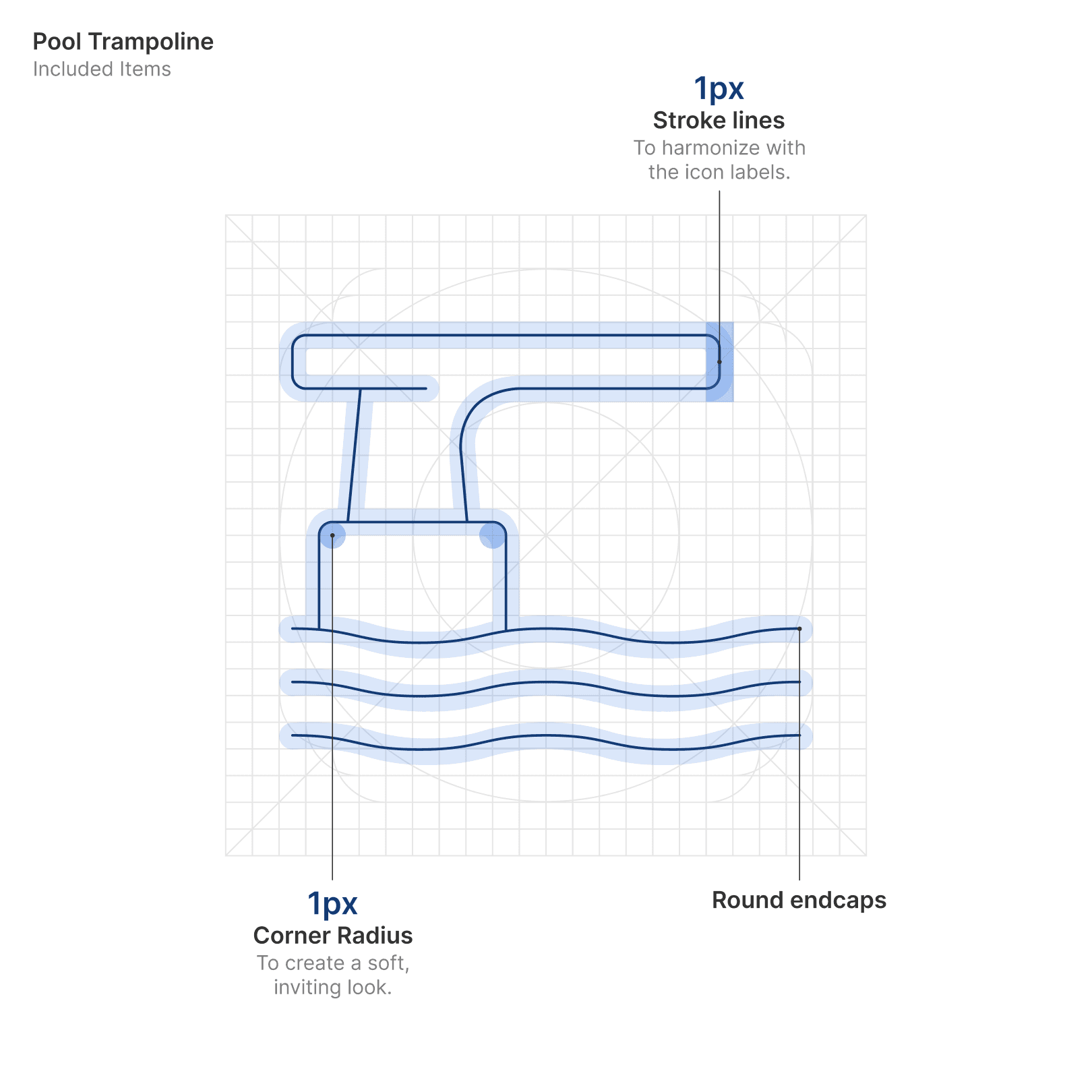
The entire library was designed on a 24px grid with 2px padding to ensure great legibility at small sizes. I defined a set of rules to maintain consistency across the set:
1px stroke width: I chose a thin, 1px outline style. This specific weight was chosen to harmonize with the website’s typography, neither too thin to be invisible nor too thick to overpower the text labels.
Friendly geometry: To avoid a cold, rigid feel, I applied a 1px border radius to corners and terminals. This subtle rounding creates a softer, more inviting aesthetic that is suited for an eco-tourism destination.
High contrast: all icons were designed as black outlines to ensure maximum contrast and readability against the interface.
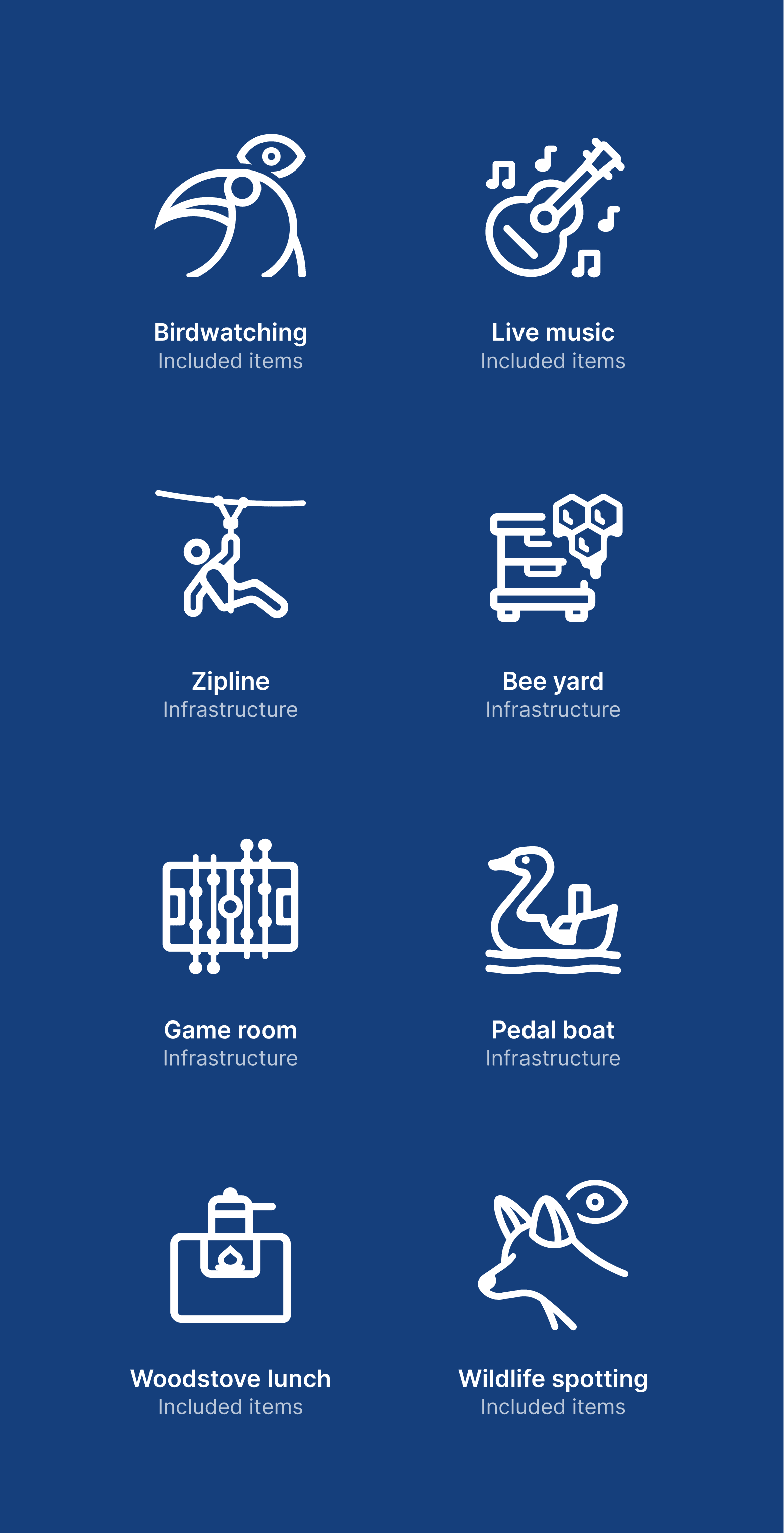
The biggest challenge was translating Bonito’s culture into such a small-sized icon system. Generic libraries were insufficient for the region’s specificities, so I had to illustrate unique local concepts that standard sets simply don’t have, such as:
Cultural specifics: icons for a traditional “Brazilian wood stove lunch” (almoço no fogão a lenha) and “pedal boats” (pedalinho).
Local wildlife: instead of generic animal symbols, I illustrated the specific fauna of the region. For example, the “Wildlife spotting” icon features a Maned Wolf, while the “Birdwatching” icon features the Toucan, which also echoes the website’s logo, bringing a distinct sense of place to a functional UI asset.

Impact and project takeaways
The icon system successfully bridged the gap between utility and identity. By replacing text-heavy lists with clear, visual cues, the icons reduced the cognitive load for users comparing complex tour details, making the booking process faster and more intuitive. Furthermore, the inclusion of specific local fauna and cultural items reinforced Portal Bonito’s brand as a champion of local culture.
Personal takeaways
This project was a deep dive into simplification and scale. The core challenge was figuring out how to represent unique concepts in their simplest forms without losing their identity, all within a realistic timeline. It taught me that defined guidelines are not constraints, but very helpful tools for maintaining consistency and clarity when managing a large volume of deliverables.

"/><stop offset="1" stop-color="rgba(0, 0, 0, 0.15)"/></linearGradient></defs><g d="M 0 4 C 0 1.791 1.791 0 4 0 L 32 0 C 34.209 0 36 1.791 36 4 L 36 22 C 36 24.209 34.209 26 32 26 L 4 26 C 1.791 26 0 24.209 0 22 Z M 35.445 2 C 34.752 0.809 33.477 0 32 0 L 18 0 L 18 2 Z M 0 20 L 36 20 L 36 22 L 0 22 Z M 18 12 L 36 12 L 36 14 L 18 14 Z M 18 8 L 36 8 L 36 10 L 18 10 Z M 0 16 L 36 16 L 36 18 L 0 18 Z M 4 26 L 32 26 C 33.477 26 34.752 25.191 35.445 24 L 0.555 24 C 1.248 25.191 2.523 26 4 26 Z M 18 4 L 36 4 L 36 6 L 18 6 Z M 0.068 22.679 C 0.085 22.772 0.104 22.865 0.127 22.956 C 0.153 23.057 0.185 23.154 0.219 23.252 C 0.308 23.511 0.416 23.761 0.552 23.995 L 0.555 24 L 35.445 24 L 35.447 23.996 C 35.581 23.76 35.692 23.512 35.779 23.255 C 35.845 23.067 35.896 22.875 35.931 22.679 C 35.972 22.459 36 22.233 36 22 L 0 22 C 0 22.233 0.028 22.458 0.068 22.679 Z M 0 18 L 36 18 L 36 20 L 0 20 Z M 0 14 L 0 16 L 36 16 L 36 14 L 18 14 Z M 18 10 L 36 10 L 36 12 L 18 12 Z M 18 6 L 36 6 L 36 8 L 18 8 Z M 0 4 Z M 0.555 2 L 0.552 2.005 Z M 0.128 3.044 C 0.153 2.942 0.188 2.845 0.22 2.747 C 0.185 2.845 0.155 2.944 0.128 3.044 Z M 18 4 L 36 4 C 36 3.767 35.972 3.541 35.931 3.32 C 35.896 3.124 35.845 2.931 35.778 2.744 C 35.691 2.486 35.58 2.237 35.445 2 L 18 2 Z M 18 0 L 4 0 C 1.791 0 0 1.791 0 4 L 0 14 L 18 14 Z M 2 2.726 L 2.618 3.175 L 2.382 3.9 L 2.999 3.452 L 3.617 3.9 L 3.381 3.175 L 3.999 2.726 L 3.235 2.726 L 2.999 2 L 2.764 2.726 Z M 4 4.726 L 4.618 5.175 L 4.382 5.9 L 4.999 5.452 L 5.617 5.9 L 5.381 5.175 L 5.999 4.726 L 5.235 4.726 L 4.999 4 L 4.764 4.726 Z M 8 4.726 L 8.618 5.175 L 8.382 5.9 L 8.999 5.452 L 9.617 5.9 L 9.381 5.175 L 9.999 4.726 L 9.235 4.726 L 8.999 4 L 8.764 4.726 Z M 12 4.726 L 12.618 5.175 L 12.382 5.9 L 12.999 5.452 L 13.617 5.9 L 13.381 5.175 L 13.999 4.726 L 13.235 4.726 L 12.999 4 L 12.764 4.726 Z M 4 8.726 L 4.618 9.175 L 4.382 9.9 L 4.999 9.452 L 5.617 9.9 L 5.381 9.175 L 5.999 8.726 L 5.235 8.726 L 4.999 8 L 4.764 8.726 Z M 8 8.726 L 8.618 9.175 L 8.382 9.9 L 8.999 9.452 L 9.617 9.9 L 9.381 9.175 L 9.999 8.726 L 9.235 8.726 L 8.999 8 L 8.764 8.726 Z M 12 8.726 L 12.618 9.175 L 12.382 9.9 L 12.999 9.452 L 13.617 9.9 L 13.381 9.175 L 13.999 8.726 L 13.235 8.726 L 12.999 8 L 12.764 8.726 Z M 6 2.726 L 6.618 3.175 L 6.382 3.9 L 6.999 3.452 L 7.617 3.9 L 7.381 3.175 L 7.999 2.726 L 7.235 2.726 L 6.999 2 L 6.764 2.726 Z M 10 2.726 L 10.618 3.175 L 10.382 3.9 L 10.999 3.452 L 11.617 3.9 L 11.381 3.175 L 11.999 2.726 L 11.235 2.726 L 10.999 2 L 10.764 2.726 Z M 14 2.726 L 14.618 3.175 L 14.382 3.9 L 14.999 3.452 L 15.617 3.9 L 15.381 3.175 L 15.999 2.726 L 15.235 2.726 L 14.999 2 L 14.764 2.726 Z M 2 6.726 L 2.618 7.175 L 2.382 7.9 L 2.999 7.452 L 3.617 7.9 L 3.381 7.175 L 3.999 6.726 L 3.235 6.726 L 2.999 6 L 2.764 6.726 Z M 6.382 7.9 L 6.999 7.452 L 7.617 7.9 L 7.381 7.175 L 7.999 6.726 L 7.235 6.726 L 6.999 6 L 6.764 6.726 L 6 6.726 L 6.618 7.175 Z M 10 6.726 L 10.618 7.175 L 10.382 7.9 L 10.999 7.452 L 11.617 7.9 L 11.381 7.175 L 11.999 6.726 L 11.235 6.726 L 10.999 6 L 10.764 6.726 Z M 14 6.726 L 14.618 7.175 L 14.382 7.9 L 14.999 7.452 L 15.617 7.9 L 15.381 7.175 L 15.999 6.726 L 15.235 6.726 L 14.999 6 L 14.764 6.726 Z M 2 10.726 L 2.618 11.175 L 2.382 11.9 L 2.999 11.452 L 3.617 11.9 L 3.381 11.175 L 3.999 10.726 L 3.235 10.726 L 2.999 10 L 2.764 10.726 Z M 6.382 11.9 L 6.999 11.452 L 7.617 11.9 L 7.381 11.175 L 7.999 10.726 L 7.235 10.726 L 6.999 10 L 6.764 10.726 L 6 10.726 L 6.618 11.175 Z M 10 10.726 L 10.618 11.175 L 10.382 11.9 L 10.999 11.452 L 11.617 11.9 L 11.381 11.175 L 11.999 10.726 L 11.235 10.726 L 10.999 10 L 10.764 10.726 Z M 14 10.726 L 14.618 11.175 L 14.382 11.9 L 14.999 11.452 L 15.617 11.9 L 15.381 11.175 L 15.999 10.726 L 15.235 10.726 L 14.999 10 L 14.764 10.726 Z" fill="transparent" height="26px" id="SjsjhaaA6" transform="translate(0 0)" width="36px"><path d="M 0 4 C 0 1.791 1.791 0 4 0 L 32 0 C 34.209 0 36 1.791 36 4 L 36 22 C 36 24.209 34.209 26 32 26 L 4 26 C 1.791 26 0 24.209 0 22 Z" fill="rgb(255, 255, 255)" height="26px" id="PiwHwam2r" transform="translate(0 0)" width="36px"/><path d="M 35.445 2 C 34.752 0.809 33.477 0 32 0 L 18 0 L 18 2 Z M 0 20 L 36 20 L 36 22 L 0 22 Z M 18 12 L 36 12 L 36 14 L 18 14 Z M 18 8 L 36 8 L 36 10 L 18 10 Z M 0 16 L 36 16 L 36 18 L 0 18 Z M 4 26 L 32 26 C 33.477 26 34.752 25.191 35.445 24 L 0.555 24 C 1.248 25.191 2.523 26 4 26 Z M 18 4 L 36 4 L 36 6 L 18 6 Z" fill="rgb(178, 35, 52)" height="26px" id="OJDf_cZ4b" transform="translate(0 0)" width="36px"/><path d="M 0.068 20.679 C 0.085 20.772 0.104 20.865 0.127 20.956 C 0.153 21.057 0.185 21.154 0.219 21.252 C 0.308 21.511 0.416 21.761 0.552 21.995 L 0.555 22 L 35.445 22 L 35.447 21.996 C 35.581 21.76 35.692 21.512 35.779 21.255 C 35.845 21.067 35.896 20.875 35.931 20.679 C 35.972 20.459 36 20.233 36 20 L 0 20 C 0 20.233 0.028 20.458 0.068 20.679 Z M 0 16 L 36 16 L 36 18 L 0 18 Z M 0 12 L 0 14 L 36 14 L 36 12 L 18 12 Z M 18 8 L 36 8 L 36 10 L 18 10 Z M 18 4 L 36 4 L 36 6 L 18 6 Z M 0 2 Z M 0.555 0 L 0.552 0.005 Z M 0.128 1.044 C 0.153 0.942 0.188 0.845 0.22 0.747 C 0.185 0.845 0.155 0.944 0.128 1.044 Z M 18 2 L 36 2 C 36 1.767 35.972 1.541 35.931 1.32 C 35.896 1.124 35.845 0.931 35.778 0.744 C 35.691 0.486 35.58 0.237 35.445 0 L 18 0 Z" fill="rgb(238, 238, 238)" height="22px" id="ZZ28bRtiC" transform="translate(0 2)" width="36px"/><path d="M 18 0 L 4 0 C 1.791 0 0 1.791 0 4 L 0 14 L 18 14 Z" fill="rgb(60, 59, 110)" height="14px" id="nViUaTF0Z" transform="translate(0 0)" width="18px"/><path d="M 0 0.726 L 0.618 1.175 L 0.382 1.9 L 0.999 1.452 L 1.617 1.9 L 1.381 1.175 L 1.999 0.726 L 1.235 0.726 L 0.999 0 L 0.764 0.726 Z M 2 2.726 L 2.618 3.175 L 2.382 3.9 L 2.999 3.452 L 3.617 3.9 L 3.381 3.175 L 3.999 2.726 L 3.235 2.726 L 2.999 2 L 2.764 2.726 Z M 6 2.726 L 6.618 3.175 L 6.382 3.9 L 6.999 3.452 L 7.617 3.9 L 7.381 3.175 L 7.999 2.726 L 7.235 2.726 L 6.999 2 L 6.764 2.726 Z M 10 2.726 L 10.618 3.175 L 10.382 3.9 L 10.999 3.452 L 11.617 3.9 L 11.381 3.175 L 11.999 2.726 L 11.235 2.726 L 10.999 2 L 10.764 2.726 Z M 2 6.726 L 2.618 7.175 L 2.382 7.9 L 2.999 7.452 L 3.617 7.9 L 3.381 7.175 L 3.999 6.726 L 3.235 6.726 L 2.999 6 L 2.764 6.726 Z M 6 6.726 L 6.618 7.175 L 6.382 7.9 L 6.999 7.452 L 7.617 7.9 L 7.381 7.175 L 7.999 6.726 L 7.235 6.726 L 6.999 6 L 6.764 6.726 Z M 10 6.726 L 10.618 7.175 L 10.382 7.9 L 10.999 7.452 L 11.617 7.9 L 11.381 7.175 L 11.999 6.726 L 11.235 6.726 L 10.999 6 L 10.764 6.726 Z M 4 0.726 L 4.618 1.175 L 4.382 1.9 L 4.999 1.452 L 5.617 1.9 L 5.381 1.175 L 5.999 0.726 L 5.235 0.726 L 4.999 0 L 4.764 0.726 Z M 8 0.726 L 8.618 1.175 L 8.382 1.9 L 8.999 1.452 L 9.617 1.9 L 9.381 1.175 L 9.999 0.726 L 9.235 0.726 L 8.999 0 L 8.764 0.726 Z M 12 0.726 L 12.618 1.175 L 12.382 1.9 L 12.999 1.452 L 13.617 1.9 L 13.381 1.175 L 13.999 0.726 L 13.235 0.726 L 12.999 0 L 12.764 0.726 Z M 0 4.726 L 0.618 5.175 L 0.382 5.9 L 0.999 5.452 L 1.617 5.9 L 1.381 5.175 L 1.999 4.726 L 1.235 4.726 L 0.999 4 L 0.764 4.726 Z M 4.382 5.9 L 4.999 5.452 L 5.617 5.9 L 5.381 5.175 L 5.999 4.726 L 5.235 4.726 L 4.999 4 L 4.764 4.726 L 4 4.726 L 4.618 5.175 Z M 8 4.726 L 8.618 5.175 L 8.382 5.9 L 8.999 5.452 L 9.617 5.9 L 9.381 5.175 L 9.999 4.726 L 9.235 4.726 L 8.999 4 L 8.764 4.726 Z M 12 4.726 L 12.618 5.175 L 12.382 5.9 L 12.999 5.452 L 13.617 5.9 L 13.381 5.175 L 13.999 4.726 L 13.235 4.726 L 12.999 4 L 12.764 4.726 Z M 0 8.726 L 0.618 9.175 L 0.382 9.9 L 0.999 9.452 L 1.617 9.9 L 1.381 9.175 L 1.999 8.726 L 1.235 8.726 L 0.999 8 L 0.764 8.726 Z M 4.382 9.9 L 4.999 9.452 L 5.617 9.9 L 5.381 9.175 L 5.999 8.726 L 5.235 8.726 L 4.999 8 L 4.764 8.726 L 4 8.726 L 4.618 9.175 Z M 8 8.726 L 8.618 9.175 L 8.382 9.9 L 8.999 9.452 L 9.617 9.9 L 9.381 9.175 L 9.999 8.726 L 9.235 8.726 L 8.999 8 L 8.764 8.726 Z M 12 8.726 L 12.618 9.175 L 12.382 9.9 L 12.999 9.452 L 13.617 9.9 L 13.381 9.175 L 13.999 8.726 L 13.235 8.726 L 12.999 8 L 12.764 8.726 Z" fill="rgb(255, 255, 255)" height="9.900000000000002px" id="tVMAVeLwX" transform="translate(2 2)" width="13.999px"/><path d="M 0 4 C 0 1.791 1.791 0 4 0 L 32 0 C 34.209 0 36 1.791 36 4 L 36 22 C 36 24.209 34.209 26 32 26 L 4 26 C 1.791 26 0 24.209 0 22 Z" display="none" fill="url(%23hkS3YYatZ-936998403-linear-gradient)" height="26px" id="hkS3YYatZ" transform="translate(0 0)" width="36px"/></g></svg>)